Place de la Concorde, the largest square in Paris is framed on all its sides by national landmarks: on one the Hotel Crillon, a luxury hotel once favoured by Marie Antoinette, swimming in white and honey coloured marbles and gilding, was, the few times I walked past it, appropriately adorned by its automotive equivalent, a walrus-like white and gold Rolls Royce; the other sides respectively accomodating the National Assembly (previously the Palais Bourbon), the beginning of the Champs Elysees, and the Tuileries Gardens.

The decorative scheme of this vast Place, designed by the architect Jacques Ignace Hittorf, and including two large fountains and a marching border of Rostral Columns, resembles more the carefuly considered and decorous elegance of a Parisian dining table than a European Square. Balancing exotic motifs and a rich, uniform colouring of sea-green highlighted with gilding, the fountains and columns manage to maintain all the allusions to ancient Rome of the high Empire style, but without any of its drum-beating pomp and bellicose, self satisfied profusion of clashing forms and colours.

Place de la Concorde has all the grandeur of a witty feminine display that at once seduces and beguiles you with its harmoniously resolved conceits, delivered with an easy and languorous tone, while slipping through an underlying message of strength and resolute confidence. There is a conversation going on between the Crillon, Assembly, Tuileries and Champs Elysees, and it is happening over the Place, whose arrangement of emerald items adorn, frame and conduct their discussion as a dinner service both generates an atmosphere and helps choreograph the sequential unfolding of an evening's events.

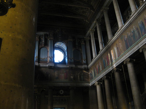
Hittorf was a great proponent of Polychromy in Architecture, fighting his ground against the "purists" in the Beaux-Arts after discovering that ancient Greek Temples had been heavily coloured. This led to the deep green ground of the Concorde, and the intended richness of colour in St Vincent de Paul, which, unfortunately, was not completed to his saturated designs.

St Vincent de Paul
Although, partly inspired by Hittorf's discoveries and all the dazzling and mysterious aesthetic splendour of the ancient world they implied, just around the corner you can visit the Atelier of Gustave Moreau, where there is more than enough painterly recreations of strange, bejewelled, encrusted and coloured worlds both to make you want to re-read Flaubert's Salammbo and Herodias, and to make up for Hittorf's unfinished masterpiece.

Detail of Salome by Gustave Moreau
Even today most discussions in architecture about colour have to be formed as apologias, as if such an indulgence were something that must be defended. In the nineteenth century, after Hittorf's discoveries, at least architects had the ever-expansive precedent of the classical world to cite as justification, with evidence ever increasingly proving the predominance of pigment in the ancient meditteranean, confounded by the ongoing excavations in Pompeii and the unearthing of its interiors that were as red as pottery and as warm as flesh. Joseph Rykwert, in his article the Polychromy of Greek Temples in edition 2 of Terazzo, even goes so far as to say that the Greeks never even considered leaving white surfaces bare (naked in their eyes), only leaving yellowish stones like Tufa or Poros without treatment, and if marble, covering it with stucco -the colour of sunlight, or at the very least staining it in a Saffron emulsion. Today however there are no such precedents to cite, and the seductive allure of pigmentation seems forever either stuck in the supporting, diagrammatic role of spatial and structural differentiation, or else as a guilty, irrational pleasure, that because of its powerful and direct appeal to the senses, can be used, but in a tightly controlled and restrained fashion, lest it swamp the practical and cerebral core of Building.

capital from stadium entrance in Olympia, by Ernst Curtius and Friedrich Adler 1896
Speaking of ancient allusion and precedent, the columnar lamposts in the Concorde, although refined and delicate, refer to an ancient tradition both imperial and antagonistic. Under all the civility of Hittorf's design, there is both the earthiness inherent in the depths of his greens, and the base swagger of the unapologeticaly triumphant: the lamposts are a rare (at the time) reinstatement of an ancient Roman tradition/motif, the nautical equivalent of their Triumphal Arches through which a returning army would pass in celebration of a conquest with its spoils, both human and financial.

Ancient ships used to have huge brass rams at their fronts, which were their main form of attack. They would speed as fast as possible into their enemy, ploughing into its side and hoping to break the other vessel in two. Following an important naval victory against the Etruscans (the first recorded) in 338BC, at Anzio, the Romans severed the Rams from the surviving Etruscan ships and attached them to walls in the Comitium, a gathering place in the Forum, to declare the vanquishing of the enemy fleet.

Reconstruction of the Rams in the Comitio
In 260BC, following a defeat of the Carthaginian fleet, the Romans erected a column in the Comitio onto which the captured Rams (also known as Rostra) were attached, creating a stand-alone monument, and a new form of column, embodying naval might and prowess, now known as a Rostral Column.

The position of a Rostrum on an ancient ship, and on a Rostral Column
After the battle of Actium, in which the Romans devastated Antony and Cleopatra's fleet, the Rostral Column was moved to a large Altar which developed into a platform from where speakers would address crowds at the Forum (hence the word Rostrum now also meaning a place from where public speakers address a crowd), sealing its position at the heart first of the Republic, and later of the Empire, meaning its form and symbolic meaning have survived to this day via classical interventions in our cities created by architects like Hittorf, and commemorating events as varied as the Battle of Lepanto, and the desire of Louis-Phillipe to imply some kind of imperial glory during his relatively morbund reign (during which the square in its current form was commsioned).


And to conclude on an entirely whimsical note that returns to the dining table, I finaly managed to purchase in Paris this figure of Paris offering his golden Apple to Aphrodite, an act inspired by voluptuosness and passion, but pregnant with the saga of an epic war and which here, in this little piece of porcelain, was compressed by the taste of the eighteenth century into a charming ornament for the desert service, whose purpose was to please the eye, and to direct conversation in case there happened to be a dearth of topics.


