Monday, 27 September 2010

Arts & Crafts Goes Budget and Comes To London: The Mary Ward Settlement in Bloomsbury


^ photo by  George P. Landow

I visited the Mary Ward Centre (previously Mary Ward Settlement) during London Open House. It was a socialy radical experiment spearheaded by the writer Mary Ward, one of those great late Victorian women who, like Dame Henrietta Barnett, the founder of Toynbee Hall, and builder of Hampstead Garden Suburb, combined in one great personality the strong conservative, religious and politicaly reactionary beliefs (Ward was head of the Anti-Suffrage league) of a lady of the empire, with a vehement moral outrage towards the rather despicable condition of the poor and underprivileged in society. She actively put into practice unusually progressive social principles in the settlement, however they were always orchestrated with typically rigorous Victorian ethics. The local population, of all classes, paid a small sum, and through the settlement had access to free legal representation, a library, music classes, concerts, training facilities for the unemployed, after-school care, as well as England's first school for physically handicapped children. The tension between upright order, and creative flexibility, between ancient tradition and equality and free will -so characteristic of Britain at the time- plays itself out as much through the architecture as it did through the services the building provided, or the character of its Grande Dame. Barely eight years after the publication of News From Nowhere, and built the same year as Ebenezer Howard founded the Garden City Association, the settlement was one of the first practical steps taken towards realising the utopian values of the Arts and Crafts movement in the civic, and particularly, the urban realm. Arts and Cratfs architecture had been almost exclusively private country houses up to that point, and the following Garden City developments by Unwin and Howard would be essentially anti-urban, diluting the city into a an endless quasi pastoral landscape, but the Mary Ward Settlement was placed in the heart of London's dense, crowded Bloomsbury, right near the intelectual hub that was UCL (Mary Ward's circle was a precursor to the later Bloomsbury set), serving the existing situation rather than running away from it, or trying to build an entirely new one elsewhere.


It makes me wish that more architecture like it had been built in London. The way it sets up its own symetrical monumentality with its two corner towers and central range, and then proceeds to joyfuly break it down means that the building both has its civic, formal presence for the wider street, but dissolves into a dynamic collection of distinct facades as you walk around it. This happens because what would usually be the focus of attention, the central wall and huge overhang, are here left blank, whilst the peripheries are busied with decoration (a pagan tree of life motif, in brick relief, decorates the southern elevation) and compositions of small windows. Important openings are also uncomfortably crushed up underneath the eaves (they even look like Palladion Windows with the central arch cut off by the roof), lifted up into a massively top heavy inhabited attic, and pushed down to the lower ground floor, just peeping up above street level, again moving focus away from the unity of the building, the breaking up of which is completed with the off-centre entrance pavilion in Portland Stone.


Inside there are similar techniques of compositional juxtaposition and interpenetration. Each of the walls of every main room has its own classicaly or country-cottage inspired decorative scheme, which usually does not match up with the scheme on the neighbouring, or opposite wall of the same room, each of which houses a fireplace, a nook for sitting, or a wash stand, so that the room is not only visually broken up, but actually pulls activities towards each of its sides, as if each of the walls belong to separate rooms that were all turned inside out to make a new one.


In the larger rooms the recurring Palladian Window motif of the building is used to further divide the space by spanning the whole of one side of the room, partially separating, but also framing a subsidiary area.


These Palladian Windows appear all over the place, being a clear and constant reminder of the building's relationship to the past, a double sign of fidelity and freedom. They are played with in a way that couldnt say more clearly that while they are a classical trope, they are entirely at the service of the architects and the effects they want to achieve, being variously stretched, squashed, simplified and elaborated, depending on whether they are being used as dormer windows, partitions, doorways, furniture, and whether they are meant to convey a sense of grandiosity and weight, mark the depth of a wall, or celebrate a spatial transition. The same goes for all the historical allusions whether reffering to country vernacular, Queen Anne or Palladianism. Nothing is used slavishly or in an Academic manner, it is all reformed and reconstituted, transformed, distorted and joined together in a technique which treats History as a creative process, rather than as a sequence of either contextually contingent singularities, or as a set of virtually inviolable precedents.


The largest space, for concerts and music classes is a large barrel shaped room placed on the top of the building. Its height, and the high positioning of its windows, is how the architects got away with the large area of blank brick and render on the facade facing Tavistock Place. On three sides you have variations of their Palladian Windows, while the fourth has the stage which looks like a structure assembled within the great tubular room, a pile of cubes containing the stairs in and out, and a hidden raised choir stall, again composed as a distinctly separate entity within the overall space, and oddly looking like the front of the Sphinx with its head and shoulders lopped off by the ceiling. The overall effect is similar to the Refectories or Dormitories of Romanesque abbeys, where a large barrel vault often has staircases and a room built into them at one end, like this one here in Thoronet. Like most places in the building, The hall is reached by two small, winding staircases that emphasise the sense of arrival, and taken together, as you move around the building through all the thin top-lit corridors, through rooms that can only be accesed through other rooms, and other staircases, you lose your orientation, and it begins to feel like an endless three dimensional labyrinth.


In many of the places where there is a punctured thickness to the walls, there are seating areas, either looking like abstracted thrones, or benches. In the photo below, there is some glass in the arch above the nook, which is an internal window to a corridor above, a trick that is used in several places, and which lets a soft glow of natural light into the corridor, and lets the occupants of the room see people passing by.


Now, although -to my great disappointment- there are no inglenooks in the settlement, there are five lovely (that i saw) bright green fireplaces, each of which was designed by a different famous Arts and Crafts architect of the time, all of them invited by the young Arnold Dunbar Smith and Cecil Claude Brewer to adorn their first work with a little celebrity touch.


English Heritage never managed to definitively attribute them to their respective designers, so the game is left to us to discern the hand of  Lethaby, Troup, Voysey, Dawber and Newton (and nice link to the great Norman Shaw there, as Newton trained at his office) 


This is Arts & Crafts on a budget, and while most of it is really quite pared down and bare (a state of uncrafted nudity that doesnt suit this style, that relies so much on exquisite detailing, finish and craftsmanship, very well) there are some moments of beautiful joinery evenly scatted throughout, like the monumental cabinet below, with its squashed and stretched proportions.


The photo above is of one of the corridors that wind their way through the building. The window to the side opens to a room below, and there are Soane-like lanterns placed often enough that there is always a gentle indirect light in these tiny, long spaces, so that while you are disappearing further into the labyrinth, you are always aware of spaces adjoining yours, and a can see up and out of the building.


Wherever rooms open up into one another, there are small spaces that mark the event, above simply by cutting away the corner and opening a tiny window with a ledge onto it, which happens in a couple other places, and below with a pair of free standing columns, and little alcoves for displaying objects.


The same principle of celebrating, and using, the meeting of two spaces manifests itself in constant level changes between areas, normally only a step or two, but below rather grandly displayed as a little Michaelangelesque moment of one room literally spilling into another. 

Its makes for a childlike experience of the building as a place to climb around, to peek around corners, in fact the effect of the breaking down of the building as a whole into so many small (and some large), composed spaces, and spaces within spaces, and winding stairs, corridors and rooms leading onto rooms, reminded me of how I used to experience large buildings as a child, never abstracting the place as a whole, as a coherent object, as I generally do now, but constantly lost in a cascade of separate moments that are discovered one after another, each almost forming a complete building of its own.


And to end -the North facade, again feeling like another building entirely to the west side facing the street, with the largest Palladian Window (the one in the music hall opposite the stage), and another strange set of tiny windows, that read instead as little solid bars, becoming a simplified entablature holding up the triumphal arch above. Go see it next September, its well worth the time.


Saturday, 25 September 2010

G-A-Y in Leuven


Stepping out of Leuven's jewelry-box town hall (which, if you dont have time can be visited in miniature at Mini-Europe, underneath Brussels' oversized Atomium), I was greeted by a bunch of giggling teenagers lying in the middle of the square in front of the Cathedral, together forming the word 'gay', out of a human typeface dressed in whatever clothes each of the members in each letter didnt mind throwing away the next day. They held the pose for quite some time, chattering to each other until they got cold, at which point they lined up in a row and began rolling over each other.


I doubt they were Leuven University's LGBT society, they were most likely using the naughty word as a way of waving their juvenile bums in the air at the still essentially Catholic nature of Leuven University proper, and its chief church.


It turned out that it was freshers weekend, and all the new students were being put through their initiations throughout the city centre, which was transformed by thousands of kids variously rolling eggs down steep hills with their noses, strapping themselves to each others' backs, chasing each other down busy streets, and -of course- drinking alot.


Escaping the pink underwear and fairy wings, I spent some time checking out Neutelings Riedijk's STUK cultural centre. A mix of buildings that has been woven together with new insertions, programmes, a small but still -in that office's manner- grand square and outdoor auditorium, and a meandering, picturesque little public path that pulls the activities through the site, and connects two parts of the city which are at very different heights.

Saturday, 11 September 2010

Gargoyles and Exhibitionism in Santiago de Compostela


Santiago de Compostela is the wettest place in Spain, and proud of it too, with the Architecture making a feature of large, numerous and prominent gargoyles and spouts like the ones above and below.


Apparently it is quite a fantastic experience to walk around town during a downpour, as torrents of water cascade down into the streets from these spouts like so many fountains. Of course the three days I spent there were unseasonably hot, with enrelentingly blue skies. Nonetheless I enjoyed imagining what it might be like, and looked up alot at the weighty layers of Churriguresque ornament that make up some of the cornices in the city centre, which together with their canon spouts tended to look like a fanciful fusion of the battleships and the architectural ornament from Giovanni Coli and Filippo Gherardi's similarly inventive, copious and gigantic fresco of the Battle of Lepanto in Palazzo Colonna. Below is the Western facade of the Cathedral of the city, and site of pilgrimage for St James, whose gold and bejewelled bust you can hug after queuing for a few hours.


In front of it is a large square with one of the buildings facing it being a Spanish Renaissance Pilgrim guesthouse and hospital, on whose cornice I was enjoying some gargoyle spotting, since there are several large ones arrayed along its roofline, when I spotted this rather unecclesiastical gentleman below utilising his position to both attempt some auto-gratification as well as to present the hordes of spiritualy uplifted pilgrims who gather daily in the square with a lyrical transformation, via some deft figuration, of God's regular gift from the heaven's into what must be a positively transubstantiatory scatological installation.


It pleased me no end that somehow this Galician stone-mason, 450 years ago, had used the effect of elemental subsumption that happens in the kind of ornamental proliferation that santiago is encrusted with, to insert something as humorous as anything found in Pieter Bruegel's drunken peasant scenes. Similar statues, although usually much smaller, were common in Romanesque churches, ostensibly as unequivocal warnings to the great unwashed of the dangers of carnal sin, as catalogued in the thorough book Images of Lust: Sexual Carvings on Medieval Churches, but for one to be placed on a building of this late a period, in this much of a prominent position, and of this size (the more louche were generally confined to smaller churches along pilgrimage routes), there must have been either a particularly lewd Cardinal who explicitly requested it during procurement,


or else there was a roving Jean Genet figure amongst the numbers making up the stone-carvers guild, bent on celebrating through the bared body of a human being the ecstatic downward rush of water fast and away from the heavens to the soil, to turn the cathedral opposite upside down and inside out as his figure gazes reverently not upwards and eastwards, but is transfixed inwards, and projects downwards, gazing firmly at his own member whilst the length of his torso arks to release through the most profane of all body parts, away from the facade, the very stuff of life.

Saturday, 10 July 2010

Four Flourishes From Lyon


A genuine time capsule from 1992: the reception desk in a restaurant/hotel overlooking the city. The complex was built inside a 16th century monastery whose original frescoes and vaulting have been renovated inside in a riotous pink, aqua-marine, mirror, velour and marble take on what the renaissance meant for luxury clientele in the late eighties. It is aptly called the Villa Florentine after "Lyon's important links with that city throughout the Renaissance", with the building being "a tribute to that era". Its the Moore-like moments of madness that do it for me... at one point in a stairwell going to the toilets, a small army of entablatures peel away from the walls into the middle of the small space to become uplit chandeliers; Just visible behind them is a wall in the room adjacent that is covered in an abstracted black-and-white leopard print pattern, which rises up to a bright-baby-pink set of huge mouldings; and to top it off the staff are grumpy, and dressed up like characters from Babylon 5.


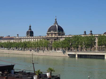
The main dome of Lyon's still functioning and huge Hotel Dieu.


Working much in the same capacity as London's Foundling Hospital the Hotel Dieu would have small turntables like the one above in several places in the city, for desperate parents to leave the children which they could not afford to take care of.


The interior of the Antiquites "Marilyn" on Rue Auguste Comte. The family who runs this shop quite clearly never get rid of anything, leading one to wonder how they know what is underneath all the piles of dolls and plates, whether things are simply compressing, cracking and folding into each other, forming little caves perfect for mice and 'borrowers', as stuff accumulates endlessly above. I wanted to see a vase that was somewhere up in the top left of the photo, leading to a scene where the lady attending the shop had to belly-crawl on top of all that porcelain, grab ahold of the shelves to lift herself up to the item, all the while telling me to keep holding up the mountain of plates with my hands and legs lest they all come tumbling down with her on top. Not the most efficient way of running the shop but quirky and memorable.

Friday, 25 June 2010

Electrical Orders and Tree Columns, an Israeli Electricity Sub-Station


In the foothills of the new towers of the Kirya area of Tel Aviv there is this electricity substation, the more laissez faire city's PoMo reply to Jerusalem's solemn essay in origin editing, identity re-construction and aesthetic conflict resolution, the supreme courts complex by Ram Karmi and Ada Karmi-Melamede.


Whereas in the Jerusalem building every choice of material in the complex had to refer to a real and related geographic location, and every use of stylistic and symbolic quotation needed to be weighed carefully to be sure of its heavy symbolic significance in relation to the rest of the complex's elements, to its symbolic function, practical purpose and social resonance lest signals get crossed, and a tense public read it incorrectly; this little substation revels in the intractable mess it makes of its component references and materials, alternately looking like an inner-city prison, a temple, a casino entrance, a factory, and, well, an electricity substation. Its materiality is indeterminate at every point except for the steel gates, with the surfaces of the compound revealing themselves to be peeling in most places -the image of their substance coming off like spray-paint- whether or not they look like concrete or metal panelling from further away.


This building looks like a plastic-toy stage set with multiple audiences in mind (although its pathos is heightened by being devoid of any real audience, being as it is in a bleak and deserted post-market-liberalisation part of town), and in a world where almost any shape and colour can be made from petroleum based plastic products, with miniature buildings, toy space stations, medical equipment and shoes being formed from the same stuff, negating the importance of the origin of a material, as well as of the link to the forms which that material once necessarily took, and replacing that importance with the supremacy of the qualities and effects derived from that original material's transformation, and the allusive power of the form it finally takes, this little mess is an architectural reach in the direction of the power of the material-less toy. It is also oddly contextual with its peeling paint and abundance of totally arbitrary symbols, fitting in with Tel Aviv's 1920s and 30s modernist "Bauhaus" apartment blocks where shapes surge like steam liners, and desperately attempt to look like skyscrapers, whilst flaking away their plaster (meant to look like concrete) and revealing their underlying brick, breeze-block and gravel structures (meant to be reinforced concrete dom-ino).


Its abundance of formal devices from its shifted grids to its "electricity orders", and its many faces as a visually playful urban object are unfortunately, like alot of buildings around it, means without any ends. It all seems like a lot of hard work for a project that got built, but turned out to have no client except a couple of  IEC employees, and the occasional architecture geek with a Canon. The space between the body of the offices and the street could have contained a lotto stall, a falafel outlet, anything that might have brought a bit of life to all the bizarre conceits, giving them more substance and enmeshing them in the everyday life of the area, although the fault might lie with the failure of the area as a contemporary urban development, being unable as it is to provide a sufficient flow of people throughout the week to keep shops and businesses alive. It is a bit like a built-in ornamental clock I once saw in a Covent Garden backyard, sitting at the top of a fire escape (which i believe was supposed to make the fire-escape tower look like a mini big-ben of sorts), which the builders had never bothered to put arms into, probably because they realised whilst installing it that it was an attempt at monumentality, without an audience for the architectural event.


Most of the buildings in the area have a similar feeling to them, but none has had so much effort put into its design, the others being mostly faceted or curving curtain-walled office towers, and whilst gates stop anyone entering the interior of the substation, and the hum of electricity passing over transistors keeps the site empty of programme and activity, at least it generously offers up its visual stimuli to anyone who cares to notice it, marking itself in whatever public space there is between the highway and the security-guarded office towers. 


Anyone can walk up to it, and hopefully one day it will be turned into a complex used for various activities, sports or shopping etc, and stand in opposition to the new generation of buildings developing slightly further up the same road, exemplified by the Yoo towers by Phillipe Starck (lobby above, and part of the nightmarish Tzameret Park Luxury High-Rise District), where all elevations facing the city are reduced to joyless whitewash, and all design effort and money is lavished on the private space of the heavily guarded interiors, rendering the feeling of an elite form of luxury that is exclusive and hidden, all the more acute (and valuable). In a typical Starck tactic the lobby of the Yoo towers are hidden behind veiled curtains that only give glimpses of the dripping interior, and security guards that are dressed like bouncers make residents feel special and welcome, as anyone else who is a member of the general public is made decidedly unwelcome. All facilities that one could need are within the complex from convenience store to gym and health clinic, leaving the sign at the entrance to the compound ringing in one's ears like a sarcastic slap: "To Live In The Heart Of Tel Aviv". Below is a paired image, on the left is the street across the road from the Tzameret Development, with its open ground floors, adhering to the old city code, open to anyone, its plots densely packed with windows opening directly onto the pavement and passers-by, and on the right is one of the two monitored entrances to the towers, with its huge distances between plots, no relationship between public space and the interiors of apartments, and a windswept isolation that was only punctuated when I visited by the distant sound of a disembodied fight between a couple up in one of the higher floors, that sounded like it was getting rather violent; the squawking of some women and a couple of men who, dressed like Pamela Andersons and Russian gangsters respectively, were gawking at the enviable future they had come to admire; and the quiet rustling and door slamming of two men who appeared to be throwing unwanted kittens into a skip.   

Wednesday, 5 May 2010

An Unfinished Ruin in Savyon, Israel


A large unfinished house in Savyon, a wealthy suburb in the Gush-Dan area of Israel. Savyon was built in the 50s as a collection of medium sized houses in large gardens, and has since developed into a showcase similar to London's Bishops Avenue, where, through an influx of money from parts of the world where aesthetic signals are mixed with an unusually audacious and un-reflective eagerness, homes grow into caricatures of status, organised around the pomp of their facades, and the music-video kitsch of their pool-sides.


While development has usually led to either faux-palace fronts, with badly made colonnades, or to obese New Mexico style adobe cubes, looking like brochures for luxury tropical resorts, there is this strange pile, not quite fitting in, that has sat regally rotting in one of the main streets for about six years.


Looking like one of Saddam's smaller attempts at architecture, after a missile strike, it was apparently built by a Georgian (or Kazakh, or Russian...) tycoon who, suffering from a mix of paranoia, bad taste and delusions of greatness, demanded that it be built as solidly as a bunker, and -one guesses- as palatial as, well perhaps less palladio and more Naboo.


Having spent alot of money pouring all that concrete into all those complicated forms, which I imagine were to last forever, it turned out that the owner's dreams came up against the fact that he had over-built the area that was zoned for construction on the plot. After spending so much building it, and the structure being so thoroughly monolithic (bunker-like basements included), it proved beyond his finances to demolishes it, let alone start again, and so it sits there, slowly rotting, and I imagine being well used by teenagers and kids.


A combination of the Edifice Complex, planning law, cheekiness and bad taste here managed to produce a quite fascinating place that simultaneously has the romantic allure of the modern ruin, like all those unfinished Dom-ino frames scattering Greece's landscape, the exotic strangeness, and mixed language, of new luxury architecture in Central Asia, as well as the weighty trace of implied defence and aggression that its interior resemblance to a bunker produces.