Saturday, 19 March 2011

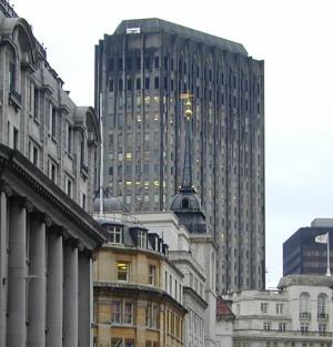
The Original Drapers Gardens (demolished)


One of a clutch of post-war, first generation skyscrapers that have either been demolished (122 Leadenhall, 20 Fenchurch Street) or re-clad and redeveloped (Britannic House, London Stock Exchange, & the soon to be reclad Guys Hospital), Drapers Gardens was one of Richard Seifert's many insertions into the London skyline, although along with Centre Point -which was finished one year before this- a particularly graceful one, sporting the same bowed frontage, which here was emphasised with continuous recessed horizontal glazing, tinted a bright green.


Finished in 1967 and standing at 100metres tall, with a pronounced presence on the skyline, up close it still felt like a small building, through a combination of small floor-plates and the way Seifert's office set it back from the street on a plinth, and created an intimate entrance sequence and range of surrounding spaces. Above you can see the rectangular courtyard (replete with cute water feature and overabundant planting) embedded in the two story plinth of offices through which you would approach the base of the tower cantilevering over an entrance in front of you, and to which you would enter from the street via a sottoportego (which you can see just to the left of the planting). To your right were a large set of stairs (from where the photo was taken) that rose with one landing to the roof of the rear of the plinth.


Rather forlorn when I visited, after the building had been vacated for some time, the second floor raised plaza to which the stairs led was a weird no man's land pressed up against the back windows of all the surrounding offices, its uneven paving watched over by several CCTV cameras and ventilation for the spaces below. It was a valiant attempt to create an open space for the tower to stand within and be admired from, but was made far more interesting, and far stranger than a successful tabula rasa through its compromise with the dense collection of ugly backsides of buildings facing it, pressing in onto it, and the way the plaza was irregularly shaped, distorted and squashed by the limitation of the irregular London plot.


With a long thin projection out towards a neighbouring road, between two adjacent offices, and sporting a concrete frame structure that was either the remnants of a building, or whose purpose I just couldnt make out (perhaps a part of the City Skywalk that was meant to extend to here someday?), but from where you could get a perfect, front on dramatic view of the bluging facade of the tower as if from its very own little axial boulevard (see photos 3&4 below). 


Like Centre Point and the Nat West Tower (the tallest Cantilevered building in the world) he lifted the main body of the building off of the plinth with some sculptural fingers that looked as if they used to be dramatically lit at night.


The space at the level of the raised plaza having no program in it apart from the core and stairs rising through it, so that you can easily see through the building to the full breadth of the site.


It was one of Seifert's more delicate designs and incorporated itself into the dense grain of the City in a layered, spatial manner that offered itself up gradually as you moved around, entered and navigated its levels, whilst still having a strong presence at each point. A much more considerate citizen of the Square Mile in its relation to the street than say all those 1980s KPF mimicking quasi-contextual beasts that covered their block-filling first three floors in granite and thereby claimed vernacular sensitivity...


and definitely much more interesting and worthy than its 2010 replacement by Foggo Assoc, that couldn't even bother with that, and just filled out the entire plot with the now typical Humungous-ginormous bank-loving trading-floor-worthy floorplates, all the way up to 73 metres, canyonising the surrounding streets and bringing a hacked and chopped up bit of Canary Wharf to this ancient site (it had been undeveloped since Roman times when the 1967 tower was built). I understand that clients want trading floors now, and a building with a floorplan like Drapers Gardens is impossible to let in the current climate (Centre Point is perennially difficult to rent out), but Im sure one can do better than what this was replaced with. I would have loved to do a simultaneous post on Britannic House, that great beast who was so much more impressive than Shell Mex House, which but for lack of a bit of stone never got listed, and that I took photos of with my old analogue camera, the photos from which have all been dispersed sometime ago in one or another move between flats somewhere in London...


^view from the street

Saturday, 12 March 2011

Page Street Housing by Edwin Lutyens


Page Street is a weird and interesting architectural in-betweener. Built on a large chunk of land given over to social housing in the 1920s by the Duke Of Westminster, it was designed by his then favourite architect Edwin Lutyens, who was mostly known for his palatial Country House designs, although he had been involved in the master-planning of Hampstead Garden Suburb just prior to this project, which meant working closely with Raymond Unwin, the great social housing designer of that period in the UK.


The grid marches across all but the internal facades of the blocks, framing traditional sash windows, and on the long sides looking like some RCA architecture student's project where hundreds of Georgian town houses have been collaged together in photoshop to make a fusion between the Bloomsbury conservation zone and the Heygate Estate. To make things odder, some of the main entrances facing the street are ornamented with heraldic sculpture, are fronted with imposing broken entablature arches with what look like little cenotaphs sticking out the top of them, and have a recessed central section and slightly projecting wings that make them look like Elizabethan palace fronts.


They also have remarkably early examples (for the UK, the first?) of deck access to the flats, reached from central courtyards, an area in the project where there is little stylistic reticence or ambiguity surrounding its programatic modernity, although the moment where (you can see it on the left and right of the image above) the deck balconies hit the sash windows and fragment to become part of the sash-window/brick/white-cement grid that covers the rest of the facades is pretty magical.


The strips of space between the U-shaped blocks is taken up with landscaped communal gardens and play areas which are a little desolate and dont get too much light, but they at least have a good sense of enclosure, and are directly watched over by lots of windows (easy to shout at your kids to come back upstairs or stop hitting each other), and rather cutely newsagents, hairdressers, shops etc are housed in little lodges arrayed along the road between the blocks and in front of the courtyard areas at the centre of the Us.


A bit like the Arts & Crafts building on Riding House Street in Fitzrovia (a workshop and offices) by H. Fuller Clark, this project is an imposing glimpse of what strange and contradictory buildings might have been designed if those british architects from Shaw through Arts & Crafts to Lutyens had brought their rhetorical talents to bear in the country's cities, and brought new programs, pressing social issues, and structural innovation together into dialogue with their wonderful & arcane stylistic concerns.


For more info, plans, sections, photos etc check out the development's page over on HousingPrototypes.

Monday, 7 March 2011

Tel Aviv Post Modern


^I particularly like the peeling-back motif, and the vertiginous staircases that come out of the core and rise up to the rooftop pool.


^For more on this temple electricity substation see here.


Unfortunately my favourite, and by far and away the wackiest is under renovation and behind scaffolding. Hopefully they are not neutralising its oddness.

Thursday, 24 February 2011

Pigmented Mini-Henge


Pigmented glass pieces from the Orsoni Workshop in Venice, which are cut up to make "smalti", or mosaic tesserae. But here acting as an adult's excuse to play building blocks.


Friday, 18 February 2011

Avant-Garde meets Orthodoxy: The Ramot Polin Housing Complex


Ramot Polin is a 720 unit social housing development in Jerusalem, built on land expropriated from the Palestinian village of Nabi Samwil from 1972 onwards, designed by Zvi Hecker, and part of a large government building campaign immediately following the 6-day war.


A certain degree of formal experimentation was allowed to pass in the rush to build, and so Hecker somehow managed to argue the case for these amazingly impractical honeycomb units on a combination of their modular replicability, and the speed at which they could be assembled, as well as a "these geometries are a part of the underlying structure of nature" type argument. They were quick to build and cheap, to boot they looked interesting, and so they were built.


The buildings are on a hill 4km north of central jerusalem, and as you approach, instead of looking like crystalline outcrops of pure geometrical forms, some of them are difficult to distinguish as entities of architecture at all, instead from afar they together manage to look just like a ramshackle village on a steep site, of which there are a few thereabouts.


Which is because the estate is an extreme example of the Israeli, and generally Middle-Eastern, tendency to radically alter and make additions to the family home outside of official planning regulations and permits.


The interior spaces are monumentally impractical, with large areas of unusable walls, horribly cramped balconies, windows that seem especially designed for children to fall out of, issues everywhere with rain screening, drainage, and lack of natural light, all amounting to the development from the beginning not attracting the middle income, secular families it was originally intended for.


The bold shapes lay empty, the government slashed rents, and a rather surprising, less assuming community slowly made it their home over the coming 30years. Several hundred Haredi Orthodox Jewish families, appreciating the low rents and seeing the awkwardness of the complex's layout as a very minor inconvenience indeed (as well as guarantee that others wouldnt follow) compared to some of the places they had previously been forced to call home, moved in on mass.


The isolated hilltop location was an added benefit, since the community could contain itself, protected, away from the rest of the city, developing into and through the Architecture to become a late 20th century version of the old Shtetls from the Pale of Settlement.


The unappealing oddness of the buildings themselves were much of the reason that these low income families could afford what are essentially very well specified apartments with full amenities, and as they set about adjusting the estate, flat by flat, year by year, staircase by staircase, to fit their evolving needs, and in some cases growing wealth, they never fully efface Hecker's forms, instead inserting variation and enhancement within, and on top of, his modular layout.


Initially minor practical alterations like plugging nooks and crannies that attract dirt and animals, sealing open edges, were followed by changes to open up the cave-likeness of the interiors to make them more livable by adding proper balconies, larger windows, air-conditioning and straightening a wall here and there, whilst more recently, together with these changes which keep being made, residents are enlarging their flats, and adding extra rooms, with each addition having its own set of materials and look of its own. Rather than consuming the original buildings, these changes bring Hecker's project to life, integrating it inseparably to the growth, development, workings and identity of a minority community, in a way realising his biological metaphors.


Not everywhere has changed so much, it is mostly the blocks that have several generations of the same families living in them that have taken full authorship over their surroundings, and have altered them alot. In the blocks which have changed dramatically, there is an unexpectedly organic union between the abstractions of Architectural Formalism, and the exigencies of everyday life and specific community needs. The project's fate, and its continuing life and evolution, is in stark contrast to Robin Hood Gardens (a fundamentally more liveable complex) in East London (finished the same year as this started), and other social housing schemes in the UK that are not only being unceremoniously cleared of their buildings, but also their residents and communities -the seed of their survival and adaptation, in the continuation in a different form of New Labour's damaging, euphemistically named 21st century slum-clearance scheme, Pathfinder.

Monday, 7 February 2011

Went to Dorset


Was very foggy. Above is the chapel of St Catherine near Abbotsbury, and below is a high ridge near the sea that -as you can see- affords "panoramic views over the stunning West Dorset countryside"...


I also visited Poundbury, but then if I talk about it here or post any pictures, that might give the impression that I found it in any way important, relevant, or even interesting. And I didnt. Salisbury Cathedral however was magnificent, and all the more for me presuming beforehand that it was just all about its silhouette, when in fact its interior is far more impressive. Its the most elegant and composed of the churches ive visited in England, having a massive, sculpted sobriety relatively missing in all the other fussy, haphazard or just plain dull British medieval Cathedral interiors ive seen (visits that are in no way exhaustive i must add). Apologies that photos do not follow here, but none of the images i took in any way convey its stoney qualities...

Wednesday, 2 February 2011

Two Medieval Men Kissing & Other Delights


This is a round encaustic tile from a medieval English pavement. The sequence of images tell a story (apologies but I cannot remember which story... it involved a king. Duh), and are the earliest set of surviving figural tiles from the British Isles. Although the men appear to be, and are indeed kissing on the lips, this was a way of passing on luck, and wishing well, for a journey rather than any more Hellenic form of younger-older male bonding.


Rather more appropriate to ambivalent European depictions of love is this delicate, but morbid, depiction by a Flemish painter from the fifteenth century, of a knight courting his object of desire. Pallid and gaunt, looking as if they have a cold, red-tinged flesh flaring at their nostrils and the sides of their mouths, the pair are watched by a disconcertingly over-eager figure of Death, who is either a reminder of the folly of earthly passions, or a stark description of what will be awaiting the man should his entreaties be rejected by the fair damsel. Fittingly the whole thing is painted on the bowing shape of a ceremonial shield.


Above is a scene from an object tenuously named "The Standard of Ur" that has survived from the ancient Sumerian town of the same name, and was recovered from a large Royal tomb. Its surface is decorated in minute mosaics, and show on one side an image of "War" and on the other "Peace", the photo here being from the side of Peace, cattle, goats, harvest and all.


Also from near Ur is this 4500 year old mosaic encrusted column, one of several found at the site of a temple dedicated to the god Ninhursag. At its heart were palm logs, covered in Bitumen, and around which were attached pieces of mother-of-pearl, pink limestone, and black shale.  Each tessera had a copper wire passed through a loop at the back of it and the ends twisted into a ring. The wire was then sunk into the bitumen for attachment. When discovered in 1919, the archaeologists found that the columns were exactly the same diameter as modern petrol drums and so during reconstruction, sections of tesserae, held in place by bandages dipped in wax, were wrapped around empty drums to restore their original shape.


All these items are on public display, free of charge, at the British Museum